Visma Employer
Company: Visma - a leading global SaaS company
Position: In-house graphic designer
Work: Campaign exploration and multi-format adaptation for employer branding and sponsorship activations
Tools: Illustrator, Photoshop + AI, InDesign
Project Overview
At Visma HQ I participated in developing the Employer Branding campaign concepts that extended the company’s refreshed identity into digital advertising. The goal was to make Visma feel human, approachable and inspiring to potential employees while keeping the system strong enough to stretch across formats.
Challenge
Employer Branding for a tech giant is tricky, because it needs to attract ambitious professionals without sounding generic, and it has to balance a clear system with storytelling that feels alive. The challenge was to design ads that were instantly recognizable as Visma while also carrying layered meaning and flexibility across contexts.
Concept and Strategy
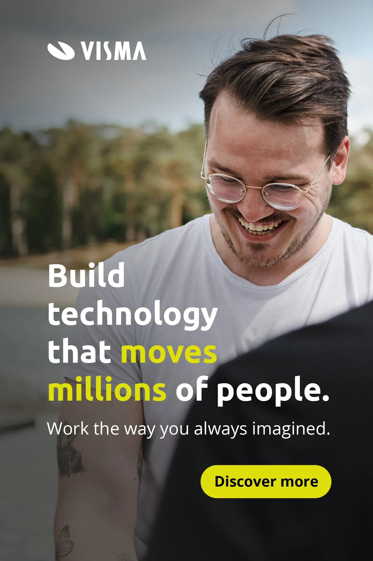
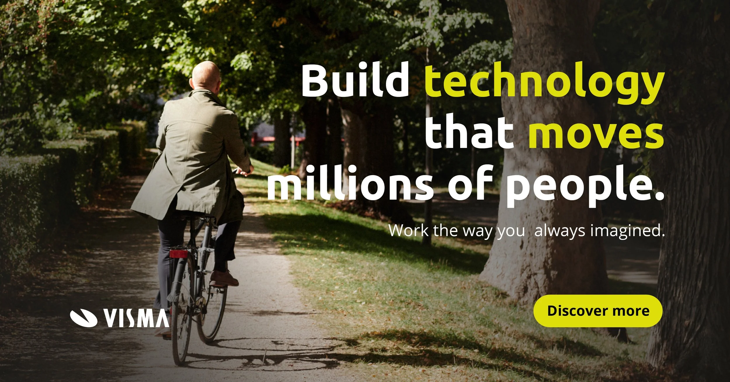
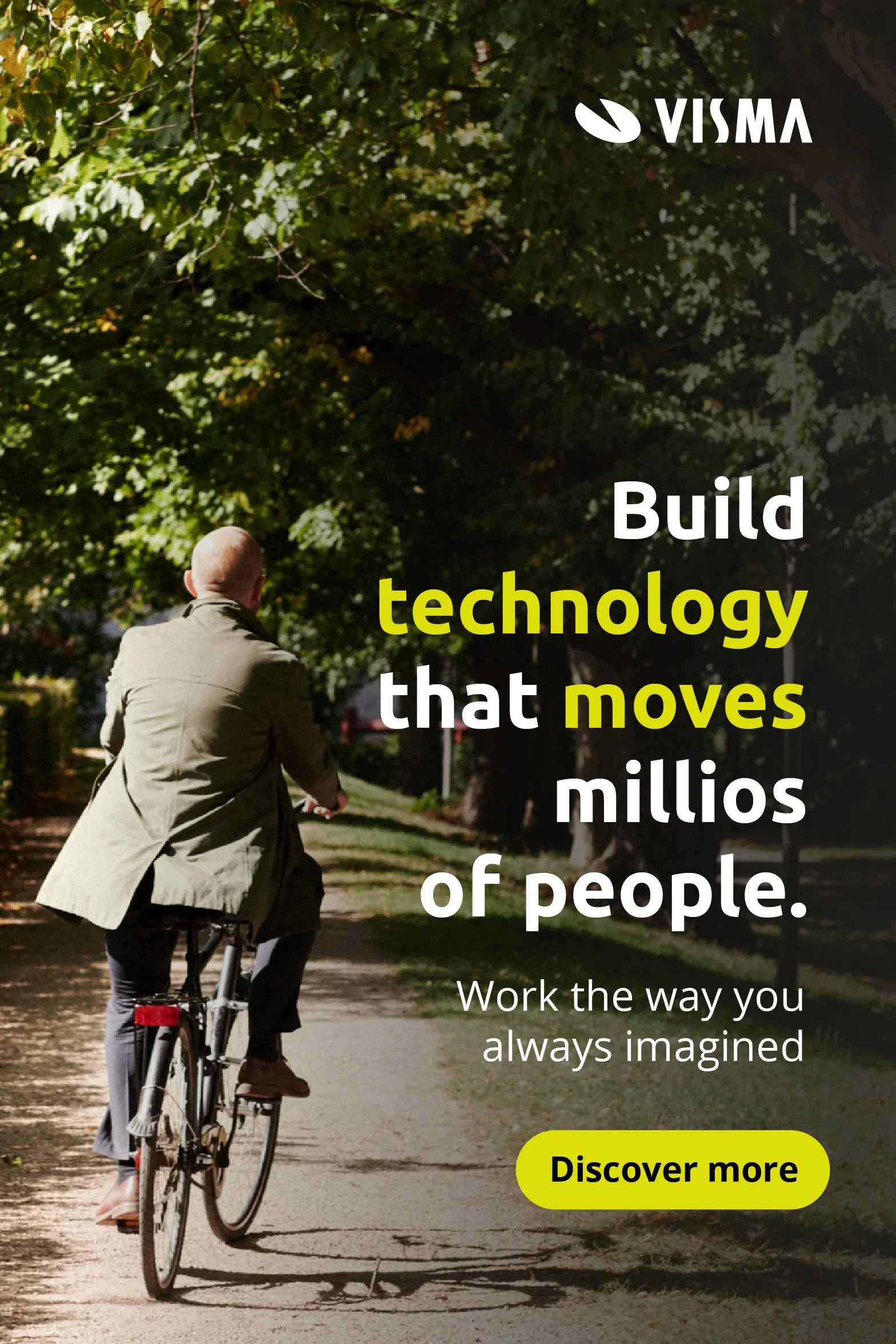
I worked with two campaign directions. The first was framed around the headline “Do you want to lead future technology projects?” with the supporting line “Work the way you always imagined.” This direction focused on ambition and leadership, visualized with lifestyle images in a documentary style. Instead of showing expected moments of people using the software in office environments, the visuals rather capture the life Visma enables outside of work: enjoying a morning bike ride in the sunshine, sharing moments, being present and relaxed. Each image carried an ambiance that felt warm and relatable. The campaign told a story of energy, balance, and possibility, which made the ads more inviting and kept the audience engaged. Everyday professionals on bikes or in candid conversation were used as double metaphors: they are moving, or even moved, thanks to Visma’s software, or they are Visma employees building tech that moves millions. The ambiguity gave the idea depth while staying relatable.
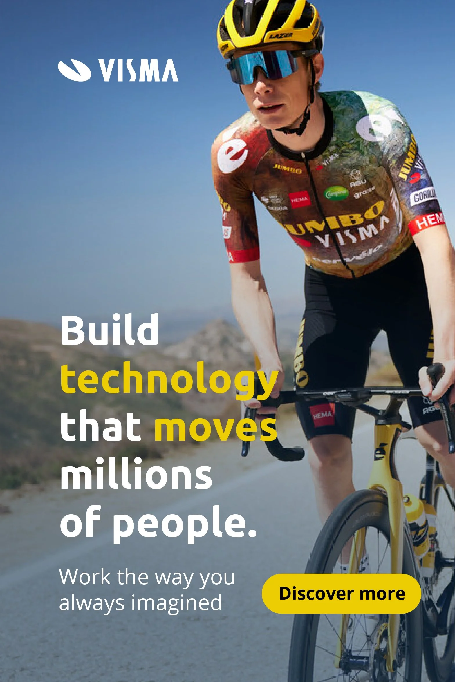
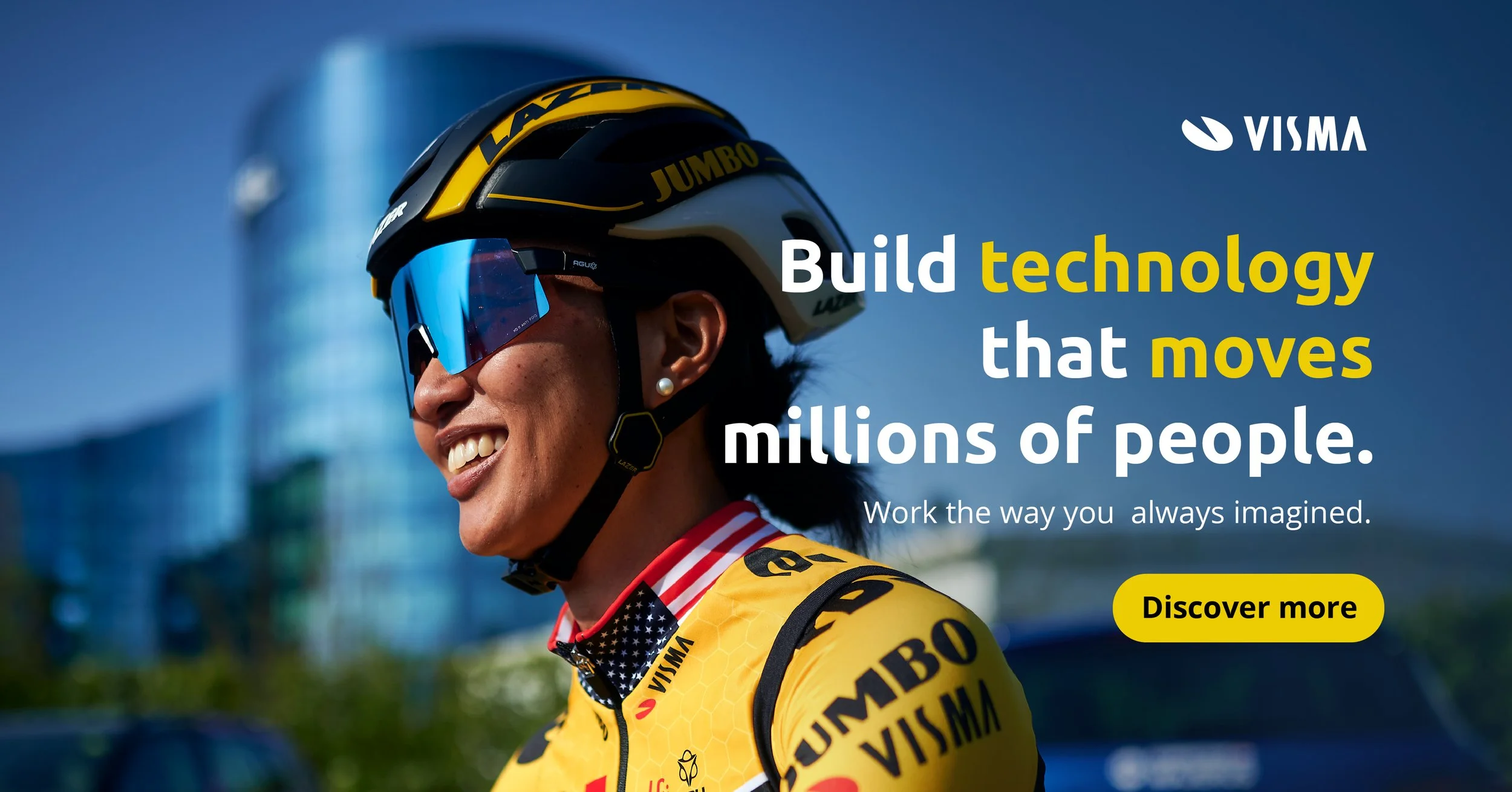
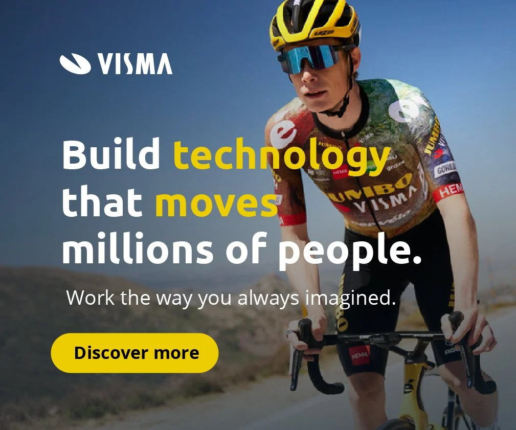
The second direction used the headline “Build technology that moves millions of people.” Here, I played with both literal and figurative movement. With imagery from Visma’s Team Jumbo-Visma cycling sponsorship, the line became literal: athletes moving at speed, powered in part by Visma’s technology. With lifestyle imagery it turned metaphorical, suggesting technology that moves people physically. Using the same headline in multiple contexts showed how the campaign could flex and stay fresh without losing coherence.
Execution
Both directions shared the same structural system: bold headline, concise supporting text, consistent CTA style and clear logo placement. I tested multiple alignments to ensure hierarchy worked across different digital formats. Each adaptation stayed within Visma’s unified brand system while allowing space for different messages and imagery to breathe. Below the final campaign visuals I also added a wider set of sketches and variations, where I’m exploring different images, placements and text pairings to test how flexible the system could be.
Impact
The work demonstrated how Visma’s Employer Branding could scale across lifestyle storytelling and high-visibility sponsorship while keeping a unified voice. By pairing strong concepts with adaptable design, the campaign showed how Visma can speak in different tones, professional, human, energetic, without losing recognition. It proved that one system could carry both literal and layered meanings, and that Employer Branding can be sharp, flexible and culturally relevant at the same time.


