Under a dark sun
Project: Key art redesign for a Netflix series
Work: Key art design including typography, composition and visual storytelling
Tools: Photoshop
This is a self-initiated key art redesign for the Netflix series Under a Dark Sun. I created two alternate covers using existing production stills and media photos from the series, reimagining the story’s emotional tone and visual identity through two different styles.
The original key art feels visually safe and doesn’t reflect the tension, symbolism, or layered tone the story seems to carry. I wanted to explore a direction that pushes mood and narrative further, something that hints at the dynamics between the characters, the emotional undertone, and the stakes without spelling everything out.
The first cover leans into mood, atmosphere, and internal conflict. A large, semi-transparent portrait of the main character is layered over a wide open field where a crime scene unfolds. Her expression is guarded and focused, and the red sky behind her suggests tension or aftermath. The police presence in the background is quiet but unmistakable. The title is cut out in a screen-layer effect so the sky shows through the text. The natural fade from dark to light in the sky causes the word "SUN" to appear yellow, while the rest of the title picks up a green tint. The result is a soft but eerie visual imbalance that hints at something unresolved.
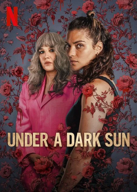
The second cover is minimalistic and stylized. It features the two main characters placed back to back. They are surrounded by oversized roses, one of which drips at the bottom. Both women are holding champagne glasses, though their body language suggests anything but celebration. The younger woman looks over her shoulder, skeptical and tense. The older woman gazes upward, suspicious and unreadable. Their faces were taken from a scene where the two characters react to an unexpected sound, which captures their dynamic without needing added narrative. The roses are exaggerated in scale to hint at something ceremonial, fragile, and quietly violent.
Visually, the redesigns push different qualities of the show forward. One is emotional, cinematic, and investigative. The other is symbolic, stylish, and psychological. Both aim to deepen the tension already present in the series while adding a stronger sense of visual storytelling.
The source imagery used to create the covers are included at the bottom of this page.
Redesigned concepts


Reference images


Original cover design